Typography and the Web
Web typography and print typography differ due to major aspects in readability and graphical quality. For example, characteristics of web type vary from user to user, and it is not a fixed thing. A few things that determine these variations are the operating system being used, browser, and the screen resolution. Also, some font faces are designed specifically for web purposes, such as Verdana and Trebuchet MS.
According to Current Typography Trends, “The evolution of typography in web design has been hampered by technological limitations.” A past issue in web typography was a lack of support for certain fonts in the web world. In other words, type face choices were limited because the internet technology was not advanced enough to make every font available for viewing pleasure, and this was also inconsistent from browser to browser. However, the article goes on to say that with recent web advancements, such as “… the retirement of IE6, almost universal support for the @font-face CSS rule, and wide-scale adoption of various web font service bureaus have facilitated the flourishing of an unprecedented burst of creative energy in web typography.” There is now more typographical freedom in terms of font choices due to our growing web technology. The @font-face and web fonts features allow users to experience typographical design in the way that the typographer had intended, and it allows the designer to communicate their ideas in a more effective way. It also saves the web design world from the horrible monotony of boring, typical font choices. These features guarantee that type faces will be viewed as intended, no matter what platform the user has.
Typically, in today’s world, larger font sizes equal better design decisions in web typography. In the land of print typography, these rules can vary, depending on the type of project or message being delivered, or the function of the design. Current Typography Trends states that “Larger fonts are not only easier to read, but also work exceptionally well as stand-alone design elements, especially with appropriate fonts.”
Another element in recent web typography advancement is the idea of responsive typography. As stated by BlueGlass.com in their Design Trends: What’s Hot in Web Typography Right Now article, “… responsive design is the idea that your layout automatically adapts to the screen definition, not just screen size but also pixel density, thus better facilitating the user experience.” This is a feature that greatly impacts the way web typography is viewed, and it is a unique aspect that you cannot experience in print. Also, font size in web is measured in pixels, or “px,” whereas print type uses points, or “pt,” as units of measurement.
Type for the web typically has followed the rule of light contrast background-text relationships (dark text on light background) for legibility purposes, but lately web typographers have started to experiment with a lower contrast combination. Current Typography Trends says that the reasoning behind this is that it “… increases the chances of the text actually being read than being glossed over.” Typographers will experiment by choosing color combinations that catch the eye’s attention rather than create a standard legible look that is typical and therefore often overlooked.
Examples of Good Web Typography
This particular website uses a very cohesive layout and color scheme within their typography. The gentle combination of blues and grays are visually pleasing and easy on the eye. They typographer used the dark text on light background rule when deciding on font colors, but not to the extreme of black on white. The text is also aligned with the imagery which helps balance the page and the menu at the top allows easy navigation.
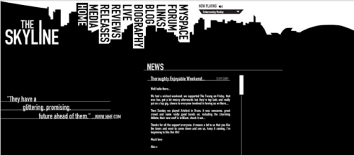
This website layout is a great example of effective typography in image. The designer used the negative space in the background of the buildings on the top of the page and utilized it for navigation purposes. The body text is separated into a text box below the building design, and this separation allows for better readability. The body text is left aligned, also making it easier to follow. The website logo is effectively placed in the top left corner, reducing clutter, and the I in “Skyline” is stretched out on top, as to give the illusion of a skyscraper. In terms of hierarchy, the text is appropriately sized, with the website title first, the navigation menu second, the subheads third, and the body copy last.


I think your website examples are really good, I had some trouble when I was picking mine and went for more obvious choices that were easy to read and only minimally designed. I think these are examples of what it really means to design for the web. They are more intricately designed then the examples I looked at and show the application of design and consideration for medium. They just make me realize how far you can take web design while still considering the accommodations needed for web design, which I forget sometimes because of how challenged by it I am!
| Posted 11 years, 6 months ago